Monday, 17 August 2015

My List of Objects and Flash Card Obsession Phase

Recently (looking through a bag of old note pads) I found an interesting artefact from my drawing past.... But it'll take some explanation.

Been involved in a speech therapy class (like I was as a child) 
you'll seen a lot of flash cards that are photographs of everyday things. 

Like this pack. 
In fact this is exactly one of a few decks I was exposed to as a child.
Colour Cards - Everyday Objects (2000 reissue)

I still remember them. Many objects isolated on coloured backgrounds, like items in an auction catalogue. I still remember a wall display back in primary school where the flash cards of photos of parts of a person (the same man) were put together in a sort of unfinished photo-collage.

Been exposed to so many, you'll soon (if you are someone who admires the aesthetics of things (i.e. into art)) develop a sort of obsession with them. And for me it developed into a desire to make my own set of photo flash cards. Except without the "photo" bit. I was just going to draw about a hundred odd pictures of random things. Well, when I say "random" I meant from a check-list I have written up. And when I said "written" I meant typed up using a typewriter (Yes, I did once used a typewriter to write up lists of things.).

I did a couple of them before 2000. It was before I discovered that book. Hey, you had to have a hobby to pass the time. I have high doubts any of them have survived somewhere in my parents place.

Now, you would think, after reading this, my list of objects obsession ended there. Right? Wrong. It was reignited by an unexpected source...

In 2000 (I think) the game-show Friends Like These gave two contestants a mental challenge - remember a sequence of 50 objects in precise order. The two contestants had coaching from Dominic O'Brien and recited the list facing the audience while a screen behind them projected pictures of the objects on green backgrounds - like the flash cards from primary school.

Soon after that, I began to write up (by hand, this time, on lined paper) lists of random objects. then I soon thought of drawing the things I have listed. I used up a few sketch pads doing this....

Which brings me back to the reason for this post. 

I had just found a complete set of drawings of one of these lists. I know its complete because...
  1. Each drawing was numbered (a rare thing for me to do back then).
  2. With the drawings I had the original lists I wrote before I began drawing them.
What a lucky find!

So here it is - a list of 75 object I made back in June 2001.
(judging from the dates I used for the newspaper and magazine.)

Original list


Why did I upload this? Its evidence of my 10,000 hours practise.
If I do find other surviving lists I'll load them up in later posts.

Saturday, 11 July 2015

The T-X Jessie model (and others) (2003)

Here's a treat form my archives. And it seems relevant due to the recent release of Terminator Genisys (I haven't seen it let, but hope the trailer isn't lying).

It's 2003. Terminator 3: Rise of the Machines has just came out. For those who didn't see it, the main gimmick this film had was it had a female terminator (in the form of Kristanna Loken). I was at my cousins place in Maybole. The film was on my mind a lot at this time. I played in my mind the concept of a Terminator-style movie featuring the characters of Pokémon (I'll elaborate more in a possible future post). In casting this cross-over it made perfect sense to cast Jessie as the T-X. Inspired by this idea I drew this...


Glad of this success, later on, I did James too...


Me today would stop here, but the 15-year-old me didn't. 

Guess who I gave the Terminator treatment next....?

Scroll down at your own peril
--------------------------------------------------------------------------------------------------------------------------


Yelp. I did Ash. Not a proud moment.


And it get's worse.....


Yelp, I did Homer and Bart too....

What was I thinking!

I could have not post the others, but I feel that failures and mistakes can't be swept under the rug. We all have to confront them sometime, We all have to to learn why they are. I'm just getting these confrontations out of the way early. If I manage to find other mistakes form my past, I promise I will post them among with my successes. 

For anyone hasn't worked out the mistake(s) let, let me explain. The reasons Team Rocket work as terminators is (simply) because their villains. Ash shouldn't have been a terminator because he's ... a good guy. Face it, he's too nice to be an assassin. If he were a vampire or a werewolf, he'll be more like a character from Rosario + Vampire than Twilight. And as for the Simpsons... the anime style works better than Matt Groening's when it comes to depicting terminators. 

The only reason I can think of why I drew them is as a challenge. An exercise as it were. I bet many artists had done similar things than this during their 10,000 hours practise. If you are an artist, please prove me right.

Sunday, 5 July 2015

The Big Alphabet Comic Draw of 2015

Recently I did something I thought I would ever do... I visited a comic convention.

This si not the first time I have ever been to one. I visited a memorabilia convention in the SECC back in 2001 and 2002.

I didn't plan it. It was prompted by an event advertised in the flyer advertising Glasgow Comic Con I collected form Forbidden Planet in June.
Glasgow Comic Con flyer (June 2015)

What made me go to it this year was one five-day event that took place on the second floor of the CCA.... The Big Comic Draw.

"Help make the biggest alphabet comic book ever made, with our Comic Artists in residence" it said.

I took it as a challenge and a call for arms. 

And so, on Wednesday 1st July I went to Glasgow, walked passed the scaffolded charred remains of the School of Art, entered the CCA and climbed the stairs to the "dealer's gallery" where the record attempt took place, not knowing what to expect.

It was modest-sized rectangular room with white walls and a bare-wood-beam floor painted in lilac. In the centre set up were six folding tables with drawing boards on each of them (like the ones I encountered back in high school, doing Graphics Communication). On one side of the room were a supply of both A4 and A3 paper, pencils, pens and rubbers. In the corner was another desk with a drawing board, this one occupied by the main comic artist-in-residence Clare Forrest. On the walls of the gallery to begin with was her illustrated alphabet of female scientists and their massive contributions to our world. Other subjects for alphabets were written up on a sheet in the corner with boxes to tick off for every letter you completed. By the time I got there (sometime between 11:30 and noon) the first dozen drawings had been added to the walls. I looked a the check-list choose one (E in the "Toys" category) and started to doodle.

Before I go on, let me explain my reasoning of the subjects I choose. I could have easily ruin this event by drawing the first thing I can think of, so to give other visitors a chance to draw I followed this rule...
If it can be easily thought of, don't do it. 
By following this rule I choose to do the more difficult letters to do. The ones I imagine most people can't think of answers for, most notably "X". How many things can you think of that begin with "X"? Excluding comic book characters, there is little to choose from, and Clare had already done the most obvious - X-rays (to cover Marie Curie). The next obvious one would be xylophone, but I didn't do that one because anyone else could have thought of it for "Toys." However, unlike most people I knew of other things that begin with X. That is why, instead of drawing a xylophone, I did xylem for "plants" (sorry of anyone who wanted to do xanthiums), the chemical element xenon for "science" and the Jaguar XJS for "cars." Now, worried about repeats, I did a Jensen Interceptor for J in "cars" to prevent another Jaguar entering the alphabet. I case someone was confused which letter that car was in, I did a Hillman Imp for "I". As for "H" I left it clear for anyone wanting to do a Honda. 

By 4pm I had added five "frames" to the walls. and about a dozen or so more were added by others.

I returned the next day. But this time I bought some reference material with me on my tablet and some ideas bought on by reading a few books the night before. During that day I added another 15 "frames" to the walls. The last one I did (the four universal forces for U in "science") was the first new "U" frame added to the walls, meaning that every letter now had at least one guest frame. 

After doing 20 frames for the comic, I decided that I overdid my welcome and went home...

Until Sunday. I came back as a proper guest. Bought a ticket at the desk, got the wristband, explored the stalls and bought a few things (with three of them signed!). Also, I returned to the room and found the room busy. The walls were also covered with "frames." It was chaotic. I noticed doubles. People were ignoring the check-list. I loved what I saw. Kids and grown adults of various levels of talent drawing together. I hope the result gets published. It'll be amazing.

In the end, I can say with confidence that (except for Clare's original alphabet) I did more frames for this comic than any other artist.

Here's all 20 of my frames (in no particular order)...


Please excuse the fact that they were rushed.

Additional note: One thing I bought was a copy of Clare's alphabet book and I got her to sign it.

My signed copy of The Mighty Women of Science Alphabet Book (2015)


(Excuse the low resolution. I would usually scan this, but I'm in a hurry)

Thank you for coming up with this massive project for Comic Con.

I hope other projects like this happen again in future.

Monday, 29 June 2015

How Motion Pictures Work

Back in February (as a duty of editor of the NAS Times newsletter) I took part in a group that visited various places in Glasgow.
On our first trip that month we went to the Mitchell Library. At the time of our visit, it was holding an exhibition about cinemas in the city. Glasgow had a lot of cinemas. In fact, in the 1930s Glasgow had more cinemas per head of population than any other city in the world.

It was after seeing this exhibition (which showed a few old projectors and various other pieces of cinema paraphernalia) that I thought about making another informative strip (like the one I did back in November).

I didn't chase this idea until just a few weeks ago when I was in the mist of making this animation.

The subject of this strip is motions pictures. As someone who loves animation, I'm fascinated how it is possible for drawings, models or photographs to become "alive" on screen. Its a very interesting thing to investigate. It involves biology as well as technology. Reading about how movies were invented is a very interesting story, involving many characters, especially Eadweard Muybridge, and mysteries, like the disappearance of Louis Le Prince. I might one day do something about this, but for now here's how motion pictures work....

Featuring The Masked Pidgeotto.


Took a bit longer than expected to make.

UPDATE: June 2017

Last night I wrote this paragraph. I think its does a better job than this strip...

“The Illusion of Life”
Human vision has the sense rate of about one tenth of a second. This means that if an object travelling across a human’s field of vision takes less than one tenth of a second to do so the eye won’t see it. If an invisible person moved an object in small intervals in that field of vision, if those movements happened in a rate more than ten times a second, it’ll appear to the eye that the moving object is “alive.” The same thing happens with still images. If you flash still images into someone’s field of vision at least 12 times a second (with some mechanism to block the image briefly as it changes to the next one) they will appear to move. But the more images you flash a second the smoother the movement appears to the eye, as the blank spaces between images become less noticeable. According to Thomas Edison, the ideal minimum rate for “flicker-free” movies is 46 images per second - "Anything less will strain the eye." 

It demonstrates what I am trying to do with my computer book.

Monday, 22 June 2015

A surprise appearance of Kai Hiwatari

Just recently (when browsing this month's copy of MyM that I bought from Forbidden Planet) I was taken aback when I instantly saw this page....

from page 6 MyM Issue 39 (June 2015)

Regular readers of this blog will know that I have a sort of.... fraternization with this particular character. So much so that he occasionally makes an appearance in this blog. It's the result of research I did for a proposed piece of fan-fiction which I talked about (a bit) back in March.

Reading the article, I'm intrigued that Paramount Pictures is planning to make a live-action movie for the franchise (and the fact that these spinning tops has made $2.5billion!).

I can pretty guess that the resulting film will involve a lot of colour-filtered CGi, as (despite the existence of real-life remote controlled tops) its nearly impossible to control the direction of a top. It's like taming a cat.

My final thought about the idea - I think it would be as successful as the live-action Dragonball movie.

Good luck Paramount, because your gonna need it!

Act of Cultural Vandalism - The Art of the Ident - The Legacy of Channel 4


Some time a few months ago I discovered this documentary made by a You-tuber called Applemask (real name Matthew Harris). His YouTube Channel is one of those channels that is mostly made of old TV ads, trailers and idents. But, unlike most of them, its creator has some attitude. If I was doing my own act of cultural vandalism on the history of Channel 4 idents, this is what it would look like. He's ready done the work.

4Sight: The Changing Face of Four (2012)

After finding this, I decided to do this mini act covering a brief history of the TV ident. They are more comprehensive histories out there on the net, if you want more details. Its the sort of geeky thing the net was made for. I can't imagine a book been made about this subject. Idents are mini moving pictures. And (as anyone who has tried to explain "bullet-time" to someone who has never seen The Matrix can tell you) moving pictures are much harder to describe in words than still images.

Please note that I'm assuming that most of the world's TV channel branding followed a similar development to the UK's (which I know a lot about), so sorry in advance for the accidental bias.

Until the 1980s most TV channels branded themselves with just their logo and a voice-over saying something like"This is CBS." Much of them usually used visual memes that reflected the national identity of the channel's audience. But a number of them did a more flare, by animating the graphics on screen. Rotation seems to be a common meme in these idents.

WABD ident (1948)

NBC ident (1949)

BBC "Bat Wings" ident (1953)

Scottish TV ident (1957)

Anglia TV ident (1959-88)

ABC ident (1960s)

ABC ident (1960)

CBS ident (1967-9)

The introduction of colour didn't change much...


ATV colour ident (1969-81)


It is worth noting that many of the more animated ones were made using mechanical mechanisms.

Thames TV logo been operated by character from Camberwick Green

More artistic flare could be seen in the things shown during sign-on and sign-off of the station (this was before 24-hour broadcasting, remember). It's in these you'll find the most patriotic of TV graphics, such as the country's flag.

Channel 3 Closedown (1983)

TVB Closedown (1987)

The most artistic I have ever encountered (by chance) was this sign-on/off from Japan....

Hato no kyujitsu (Dove's Day Off) 
Nippon Television's sign on/off ident (1953-2001)

Apart from these, most TV channel branding was... well, boring. Even with the introduction of computer graphics in the 1970s didn't change much....


Ident history of Globo (1977-99)

OECA ident (1975)

That was until November 1982, when this appeared on UK TV screens...

Hamlet Cigar Ad parody of Channel 4 ident (1984)

Sorry, wrong clip. This appeared on UK TV screens....

Channel 4 ident (1982)

This ident was a massive game-changer in television graphics design. It wasn't because it was a first in the history of computer graphics (as shown before, computer-generated idents have been used for years on TV way before 1982).
What is significant about Channel 4's ident was it was just one facet of something bigger - the branding of an entire TV channel. Until then, their was nearly no design consistency throughout a channel's own graphic design. The sign-on/off and the captions used to tell what was on were only matching in what fonts and colours were used. And it gets worse when you consider the seasonal decorations they do during holidays, such as Christmas. 

These graphics from BBC 1 in the mid-1970s are typical of what I'm talking about.


BBC 1 graphics from 1975-7

You see, no true design consistency, especially the Christmas one. 

Martin Lambie-Narin's work for Channel 4 changed all that. Although (to begin with) everyone else didn't exactly "get it." Everyone else thought it was the use of CGi that was key to this success. This resulted in a rush for many broadcasters to create their own computer-generated idents....

BBC 1 "COW" ident (1985)


LWT logo (1983-6)

TSW ident (1982-5)


Scottish TV ident (1986)

Eventually (through Lambie-Narin's later work and the increase of TV channels brought on by developments in satellite and cable services) other channels finally got what he had done to Channel 4 and followed suit. Lambie-Narin himself helped sort out the BBC's own identity in the 1990s, beginning with the idents for 1 and (especially) 2, eventually doing over the whole organization

The creation of the 90s "2s"from
How Do They Do That? (BBC 1,1995)

For those who haven't exactly worked out why Lambie-Narin's a genius, note what Alan Yentob said about the previous BBC 2 ident, the boring "TWO." 
"I realised there was a problem almost as soon as I took over the channel [BBC 2]. It was obvious that the logo made absolutely no impact. In fact, it was something anyone could have told you. It was singularly unmemorable, and told you nothing about the personality of the channel." - Alan Yentob
The reason Lambie-Narin's Channel 4 ident worked because it stood out. Let me describe this impact with an analogy. Imagine you are in a supermarket browsing the shelves. The products on the shelves are TV channels and your eye movements from one product to an other is you pressing buttons on the remote. 


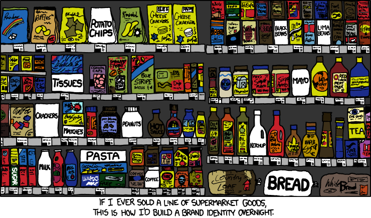
Until Lambie-Narin's blocky 4, TV channel idents were like the design of packaging used on supermarket own-brand stuff. They don't "shout out" to tell you who or what they are. Imagine an aisle full of own-brand stuff. It would be a very dull site. That blocky 4 was the first introduction of eye-catching branding in that aisle. Ironically, to have the same impact today, you have to do the reverse....

"Brand Identity" xkcd (21th December 2011)

This web comic strip also illustrates another thing that affected Channel 4's impact at the time - the increase of channels. The boring branding of the past worked fine when their was few TV channels (The UK only had three until Channel 4 came along (duh)). But with more channels coming on air that supermarket shelf in channels that boring branding couldn't work any more. Channels needed to stand out from the crowd. And that was Lambie-Narin's big idea. To grab viewers attention, TV channels needed to brand themselves like washing powder. 

Today, every channel on TV around the world has (in some form) an instinctive visual brand. You'll see it every time you change channel between shows. And that is Channel 4's legacy.

One final note; in the end of his documentary, Harris made a prediction that the next redesign of the Channel 4 logo will involve coloured blocks. Have you seen the recent ads about Channel 4's on-demand service?
Introducing All 4 ad (2015)
I know this isn't technically an "ident," but it is regularly-used graphic on the channel, so it counts as an ident to me.

And another note; the animation at the start of this post is the first piece of animation I have made in three years. I had plans for many cooking up in my mind during that time, but it is only now I finally developed the willpower to do it. So, watch out! More may be coming soon (but don't hold your breath. This isn't a regular service.)

UPDATE: On September 29th 2015 Channel 4 finally changed its idents... into something very bold and kind of unique... and unexpecting (except if your Applemask).

Channel 4's new idents (2015)