
Some time a few months ago I discovered this documentary made by a You-tuber called Applemask (real name Matthew Harris). His YouTube Channel is one of those channels that is mostly made of old TV ads, trailers and idents. But, unlike most of them, its creator has some attitude. If I was doing my own act of cultural vandalism on the history of Channel 4 idents, this is what it would look like. He's ready done the work.
After finding this, I decided to do this mini act covering a brief history of the TV ident. They are more comprehensive histories out there on the net, if you want more details. Its the sort of geeky thing the net was made for. I can't imagine a book been made about this subject. Idents are mini moving pictures. And (as anyone who has tried to explain "bullet-time" to someone who has never seen The Matrix can tell you) moving pictures are much harder to describe in words than still images.
Please note that I'm assuming that most of the world's TV channel branding followed a similar development to the UK's (which I know a lot about), so sorry in advance for the accidental bias.
Until the 1980s most TV channels branded themselves with just their logo and a voice-over saying something like"This is CBS." Much of them usually used visual memes that reflected the national identity of the channel's audience. But a number of them did a more flare, by animating the graphics on screen. Rotation seems to be a common meme in these idents.
More artistic flare could be seen in the things shown during sign-on and sign-off of the station (this was before 24-hour broadcasting, remember). It's in these you'll find the most patriotic of TV graphics, such as the country's flag.

4Sight: The Changing Face of Four (2012)
After finding this, I decided to do this mini act covering a brief history of the TV ident. They are more comprehensive histories out there on the net, if you want more details. Its the sort of geeky thing the net was made for. I can't imagine a book been made about this subject. Idents are mini moving pictures. And (as anyone who has tried to explain "bullet-time" to someone who has never seen The Matrix can tell you) moving pictures are much harder to describe in words than still images.
Please note that I'm assuming that most of the world's TV channel branding followed a similar development to the UK's (which I know a lot about), so sorry in advance for the accidental bias.
Until the 1980s most TV channels branded themselves with just their logo and a voice-over saying something like"This is CBS." Much of them usually used visual memes that reflected the national identity of the channel's audience. But a number of them did a more flare, by animating the graphics on screen. Rotation seems to be a common meme in these idents.
WABD ident (1948)
NBC ident (1949)
BBC "Bat Wings" ident (1953)
Scottish TV ident (1957)
Anglia TV ident (1959-88)
ABC ident (1960s)
ABC ident (1960)
CBS ident (1967-9)
The introduction of colour didn't change much...
ATV colour ident (1969-81)
It is worth noting that many of the more animated ones were made using mechanical mechanisms.
Thames TV logo been operated by character from Camberwick Green
Channel 3 Closedown (1983)
TVB Closedown (1987)
The most artistic I have ever encountered (by chance) was this sign-on/off from Japan....
Hato no kyujitsu (Dove's Day Off)
Nippon Television's sign on/off ident (1953-2001)
Apart from these, most TV channel branding was... well, boring. Even with the introduction of computer graphics in the 1970s didn't change much....
Ident history of Globo (1977-99)
OECA ident (1975)
That was until November 1982, when this appeared on UK TV screens...
Hamlet Cigar Ad parody of Channel 4 ident (1984)
Sorry, wrong clip. This appeared on UK TV screens....
Channel 4 ident (1982)


This ident was a massive game-changer in television graphics design. It wasn't because it was a first in the history of computer graphics (as shown before, computer-generated idents have been used for years on TV way before 1982).
What is significant about Channel 4's ident was it was just one facet of something bigger - the branding of an entire TV channel. Until then, their was nearly no design consistency throughout a channel's own graphic design. The sign-on/off and the captions used to tell what was on were only matching in what fonts and colours were used. And it gets worse when you consider the seasonal decorations they do during holidays, such as Christmas.


BBC 1 graphics from 1975-7
You see, no true design consistency, especially the Christmas one.
Martin Lambie-Narin's work for Channel 4 changed all that. Although (to begin with) everyone else didn't exactly "get it." Everyone else thought it was the use of CGi that was key to this success. This resulted in a rush for many broadcasters to create their own computer-generated idents....
Eventually (through Lambie-Narin's later work and the increase of TV channels brought on by developments in satellite and cable services) other channels finally got what he had done to Channel 4 and followed suit. Lambie-Narin himself helped sort out the BBC's own identity in the 1990s, beginning with the idents for 1 and (especially) 2, eventually doing over the whole organization.
The creation of the 90s "2s"from
How Do They Do That? (BBC 1,1995)
For those who haven't exactly worked out why Lambie-Narin's a genius, note what Alan Yentob said about the previous BBC 2 ident, the boring "TWO."
"I realised there was a problem almost as soon as I took over the channel [BBC 2]. It was obvious that the logo made absolutely no impact. In fact, it was something anyone could have told you. It was singularly unmemorable, and told you nothing about the personality of the channel." - Alan Yentob
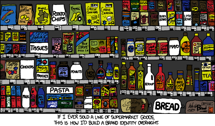
The reason Lambie-Narin's Channel 4 ident worked because it stood out. Let me describe this impact with an analogy. Imagine you are in a supermarket browsing the shelves. The products on the shelves are TV channels and your eye movements from one product to an other is you pressing buttons on the remote.

Until Lambie-Narin's blocky 4, TV channel idents were like the design of packaging used on supermarket own-brand stuff. They don't "shout out" to tell you who or what they are. Imagine an aisle full of own-brand stuff. It would be a very dull site. That blocky 4 was the first introduction of eye-catching branding in that aisle. Ironically, to have the same impact today, you have to do the reverse....
"Brand Identity" xkcd (21th December 2011)
This web comic strip also illustrates another thing that affected Channel 4's impact at the time - the increase of channels. The boring branding of the past worked fine when their was few TV channels (The UK only had three until Channel 4 came along (duh)). But with more channels coming on air that supermarket shelf in channels that boring branding couldn't work any more. Channels needed to stand out from the crowd. And that was Lambie-Narin's big idea. To grab viewers attention, TV channels needed to brand themselves like washing powder.
Today, every channel on TV around the world has (in some form) an instinctive visual brand. You'll see it every time you change channel between shows. And that is Channel 4's legacy.
One final note; in the end of his documentary, Harris made a prediction that the next redesign of the Channel 4 logo will involve coloured blocks. Have you seen the recent ads about Channel 4's on-demand service?
Introducing All 4 ad (2015)
I know this isn't technically an "ident," but it is regularly-used graphic on the channel, so it counts as an ident to me.
And another note; the animation at the start of this post is the first piece of animation I have made in three years. I had plans for many cooking up in my mind during that time, but it is only now I finally developed the willpower to do it. So, watch out! More may be coming soon (but don't hold your breath. This isn't a regular service.)
UPDATE: On September 29th 2015 Channel 4 finally changed its idents... into something very bold and kind of unique... and unexpecting (except if your Applemask).
Channel 4's new idents (2015)
No comments:
Post a Comment